Our Brand
Rugby Canada Communications
No bells. No whistles. Bold, straight forward, and genuine. This is Rugby. This is Canada.
Rugby Canada’s new brand
Rugby Canada’s rebrand is the result of extensive research that was undertaken to better understand rugby’s position in the Canadian market place. With a view to capitalizing on the growing interest of the sport, the goal was to evolve the brand and the core pillars of what the sport means to the current rugby community and new potential fans and athletes.
The newly introduced Rugby Canada brand was developed by Hulse & Durrell, an award winning Canadian design firm based out of Vancouver, and known for their exemplary work on the Vancouver 2010 Olympics, both Canadian and International Olympic Committees, as well as several other Canadian National Sport Federations. The new website was designed and developed by Locomotive based in Montreal, an award-winning bilingual agency that has helped bring Rugby Canada's digital presence to the next level. Funding for Rugby Canada’s new brand system and platform was made possible through the Canadian Olympic Committee’s National Sport Federation “Brand Enhancement Initiative” project.
The new brand brings an unmistakable look and feel to Canadian rugby. No bells. No whistles. Bold, straight forward, and genuine. This is rugby. This is Canada. The brand was built on the themes that make this sport remarkable. Courage, tradition, honour, perseverance, and straight up fun. And, the look was influenced by nearly half a century of Canadian rugby iconography.
“Canadians have signaled that rugby is now and forever-more a rugby loving nation, and their support has inspired us to reach for even greater heights – that’s what this new brand represents,” said Allen Vansen, CEO, Rugby Canada. “This design pays homage to our heritage, while pointing to a future where Canadians intuitively connect to our brand and its values – because they share them with us as Canadians – and it is a critical component to growing the sport’s profile, participation, and sustainability.”
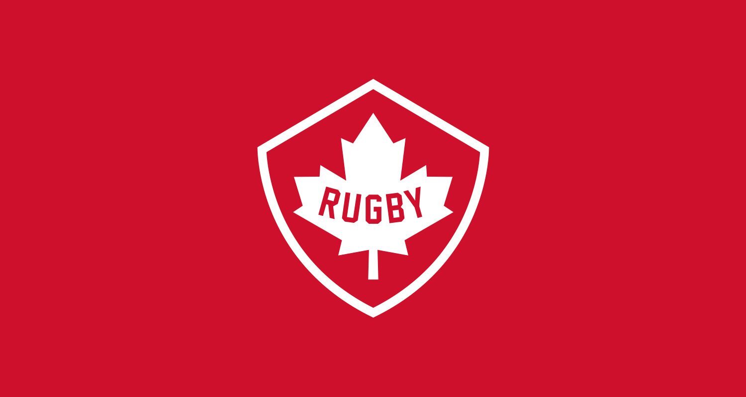
A strikingly simple logo is at the heart of the new brand. The sport is center stage, set within an angular interpretation of the maple leaf — a symbol instantly understood around the world. The logo is framed by a shield, referencing the sport’s heritage and barricade-like athletic qualities. It’s an unmistakable design that will help connect fans and future players to the sport of rugby in Canada, and serve as a powerful symbol of pride and excellence for Canada’s men’s and women’s high-performance teams.
“Nothing says Rugby like the word itself, so we put it at the heart of the brand. Rugby is bilingual, crystal clear and only five letters,” said Greg Durrell, Partner, Hulse & Durrell. “It’s a rare opportunity for a national sports brand.”
“We are thrilled to have captured the spirit, values and traits of Canadian rugby in a strong, simple and distinctive way,” said Mark Lemmon, Chief Commercial & Marketing Officer, Rugby Canada. “We also look forward to seeing the new brand come to life through our new website that will be the hub for Rugby Canada’s digital platform, and will increase awareness and impact through engaging features for fans, followers and the broader community.”
For more information on Rugby Canada’s new brand platform, please click here